The housing market is in an unfamiliar place. After several years of appreciation and a few years of massive booms across the U.S., the train is finally losing steam.
With affordability maxing out, prices are on the decline, along with increasing inventory, median days on market, and migration patterns that are disproportionately affecting the way markets rise and fall.
Here are six charts that characterize the current housing market.
Affordability Is Lower Than Ever
First things first, mortgage rates have skyrocketed this year from an exceptionally low 3% to just over 7% as of early October. While 7% is still lower than historical rates that flirted with 20% in the 1980s, it has still created sticker shock for prospective homebuyers calculating their would-be monthly payments and has led to the fastest declining affordability rate ever seen.

Of course, we have the Fed to blame for this. Chairman Jerome Powell’s ultimate goal is to defeat inflation. Raising interest rates, especially at the pace they’ve been doing so, is meant to quell spending and slow down the economy. Housing prices are just one piece of the puzzle.
The combination of historically high real estate prices, rapidly rising interest rates, and 40-year highs in inflation have made this the least affordable market we could imagine. According to the NAHB/Wells Fargo Housing Opportunity Index, which measures the relationship between household income and housing cost, the index is at the lowest its ever been.
Prices Are Starting To Soften
Speaking of prices, the S&P/Case-Shiller Index has looked wild since the beginning of the pandemic. Would you believe me if I told you that it had its first recorded month-to-month drop since December 2018 to January 2019? Look for yourself.

Of course, a one-point drop isn’t the beginning of housing armageddon, but it breaks the trend and shows that we’re moving into a softer market. It’s also important to note that this data hasn’t been updated since July, so when August’s data comes out, we’re expecting to see this fall even more.
Overall, appreciation has been rising since 2012 and really hit the gas in 2020. This is the first time many new investors are seeing any sort of drop in prices, which is a significant development. It’s important to note that home prices are still up year-over-year (YoY). Redfin’s data from August suggests we’re still up 6.7%YoY. However, this is expected to change as the months roll by.
Supply And Demand Remains Complicated
BiggerPockets’ VP of Data and Analytics, Dave Meyer (who also just happened to write this book), spoke about the “lock-in” effect several months ago before mortgage rates were increasing as fast as they are now. The idea is that as mortgage rates increase, homeowners will be less inclined to sell their homes as they likely have lower fixed rates and may find it harder to afford their next home. They’ll also find themselves selling in a market with falling prices yet higher costs of living.
While statistics suggest that the average length of time a homeowner stays in their home is eight years, the odds of them selling right now are low anyway if they locked in a 3% rate within the past couple of years.
I’ll also remind you that mortgage rates still hovered around 4% in 2014. As rates increase, you may find that many would-be equity-rich sellers who have lived in their homes for a long time will hold out until rates come back down. It’s also important to note that homeowners who may have had high rates probably refinanced within the last two years, resetting the clock.
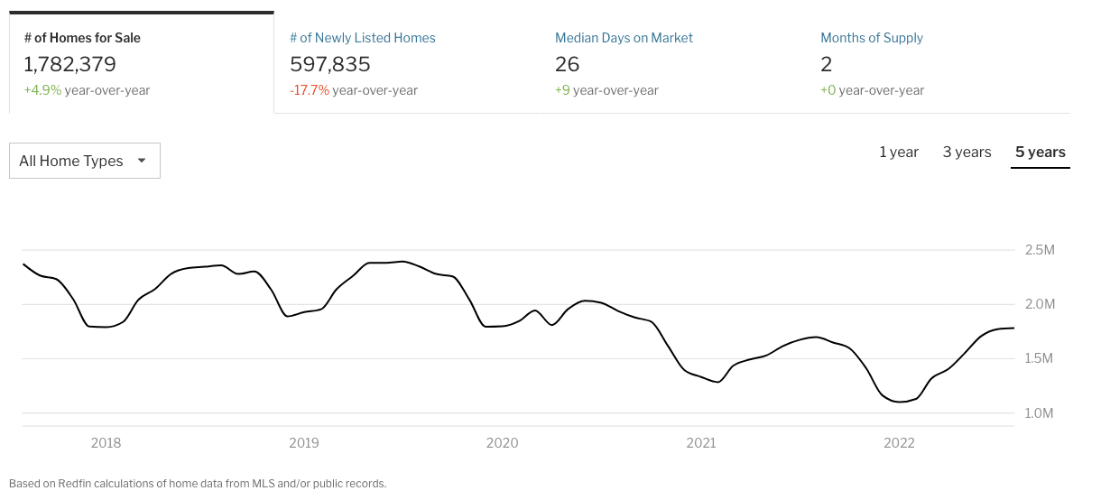
Regardless, inventory, while rising, is still staying within cyclical norms.

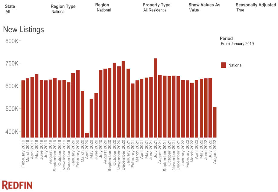
However, new listings are down, which is a sign of what’s to come.

Here’s the conundrum. If supply decreases, demand remains higher, despite it decreasing. I think it’s pretty evident that demand will remain higher than supply for the foreseeable future. The question is how well it paces against supply, as that will be a big factor in how much home prices rise and fall. And, even more importantly, where.
Migration Patterns Are Distinct
The question of where brings me to my final analysis for this article. Migration patterns are ever-present, but there were some big-time winners during the pandemic.
Austin, Texas; Boise, Idaho; Tampa, Florida; Phoenix, Arizona; and many other cities saw tremendous growth during the pandemic. Meanwhile, juggernaut cities like San Francisco and New York City lost some of their population.
During the pandemic, many of those boom towns saw the highest appreciation rates in the country. Austin’s median sales price capped out at $670,000 in May, up 15.5% YoY. Boise got up to $585,000, nearly 21% YoY.
But now, those same markets are softening, both taking $100,000 median sales price tumbles since their peaks.
What does this mean? A couple of things. One, it proves the affordability crisis is real and is either pushing people out of markets or preventing them from coming in. Second, it means that some markets will continue to appreciate while others will decline.
Most importantly, the markets that experienced the most rapid appreciation stand to lose the most, as some may have overinflated well beyond their intrinsic values. Picking and choosing which markets will wind up like this is easier said than done. However, by looking at the regional migration patterns below, you can get a pretty good idea of what homeowners are thinking.
Real estate is local. Therefore, keeping track of local trends is just as critical to making sound investments as any national trend can show. One of the more overlooked but essential elements of market analysis is recognizing and understanding population trends.
If a state’s population is growing, is that because the state is experiencing an influx of newcomers? Or is it just a product of birth rates?
Furthermore, does the state offer business or tax incentives that would lead folks to move from places with higher taxes or poor business incentives? Exhibit A is the migration from California to Florida. California, one of the country’s highest-taxed states, versus tax-free Florida.
With enough research, you can make well-educated bets on what markets stand the most to gain—and lose.
Conclusion
As the housing market shifts, staying informed is the best way to protect yourself and your investments. These charts paint a picture of where we’re at right now, but things can change quickly.
However, even if the market you’re in (or want to be in) is starting to soften, it could still be a decent bet in the long run if the intrinsic economic factors are in line. If the population is growing and business and wage growth are solid, you wouldn’t be out of your mind to invest during the dip and ride out the wave.
After all, real estate is considered one of the safest investments you can make. And most of the time, when markets fall, they rise again.
On The Market is presented by Fundrise

Fundrise is revolutionizing how you invest in real estate.
With direct-access to high-quality real estate investments, Fundrise allows you to build, manage, and grow a portfolio at the touch of a button. Combining innovation with expertise, Fundrise maximizes your long-term return potential and has quickly become America’s largest direct-to-investor real estate investing platform.
Note By BiggerPockets: These are opinions written by the author and do not necessarily represent the opinions of BiggerPockets.

